Sunday, July 10, 2022
Tuesday, June 28, 2022
Friday, May 22, 2020
Sunday, April 5, 2020
Light and shadows
Now we are going to break down the terminology of light and shadows to build up form realistically. If not done right, your image will become muddy - we'll take a step-by-step approach without colour so that doesn't happen. It is better to study light and shadows without colour because it's best not to overwhelm yourself especially if you don't know anything about colour. You have to know how to paint with values before you know how to paint with colour.
Learning the terminology and the know-how to apply it will help give you the tools to make a more realistic image.
Terminology, observation and thoughts
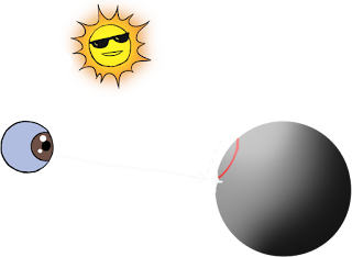 The point of reflection of the light source on the surface of an object which will be the brightest value on the object and will move with you as you move around. Not all materials will show the highlight (some materials absorb light). Also it's not perpendicular to the light source. Remember not to make the mistake of placing the highlight in the same place as the center light - see below. Highlights can be sharp or soft depending on the light source or the material.
The light sources will be perpendicular to the center light on an object.
The values on the light side of the object depend on the surface's angle to the light.
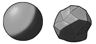 There are no hard edges on the center light. The planes that are more angled to the light (perpendicular) are the brightest. Planes will become darker the more oblique the angle to the light source; they will be more in the shadow especially when parallel to the light source. The center light helps give the light side more volume which helps it not be so flat - this is one of the keys to making an object realistic.
The halftone depends on how light or dark an object is overall, and is influenced by the light hitting it. The background will influence the halftone too, like a very bright or dark scene.
A lot of people have trouble finding the halftone at first. That's why it's good to learn the anatomy of light and shadow to know where it is.
My current process is to identify what my halftone is first of all, then paint the halftone, then add shadows and finally add lights.
Strong light will give objects in the light less halftone and a weak light will give it more. Also
forms with hard mechanical shapes will have less and rounded objects will have more halftone.
In this example, the light and shadows stay the same but the halftone changes.
This shows you the effect the halftone has.
The halftone is usually angled to the light so it is part of the light family of values.
(Terminator also called bedbug line)
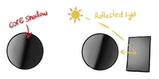
This is the line that borders the light and the shadows.
It can sharp or blurred depending how strong the light is.
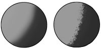 Round forms will have a more blurred terminator and angled forms sharper will have a sharper terminator but again it all depends on the light source.
Textures tend to pop out at the terminator more in hard light than in soft light.
The cast shadow comes from a direct light source shining on an object and casting the shape of the object on the ground plane.
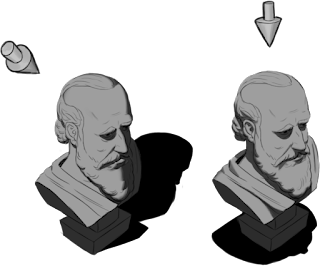 The cast shadow changes depending on the light source's position and how strong the light source is. The closer the light is to an object, the sharper the cast shadows will be and the darker it can be too. If the light is further away from the object, the shadow on the ground plane will be more blurred (this is also depending on what type of light is used).
(Also called Contact shadows)
These shadows are an effect of ambient occlusion
which will appear more in soft light and also be seen
in other lighting conditions like diffused light or hard light.
Here's all of them together step by step
Diffused light^ Soft light^
Many people think diffused light and soft light are the same thing, which even I thought they were before studying for this blog post.
Diffused light has no reflective qualities so there's a lot less contrast which will make objects look flatter. This is why it is used in portraits which softens facial features. It's also commonly used in office lighting which is the best light for seeing objects clearly on your desk.
For soft light, there isn't a hard description - it's just soft light that does have reflective qualities and has a soft highlight, and soft shadows. Where the object contacts with the ground plane, you will get occlusion shadow which will make the shadow side darker. Soft light is commonly found in nature like on an overcast cloudy day.
(Also named hard light) comes from a light source directed on an object (or objects) casting shadows off them. So the brighter the light source, the harder the shadows will be. The edges in the shadow, including the objects edges, are generally softer than in the light. This type of lighting will help create drama and suspense so it has a strong visual impact.
There is one big factor for finding out if an object is affected by hard light or soft light - it the size of the light in relation to the object. If the light is larger, the light source will be softer but if the light is smaller, the light source will be harder.
--------------------------------------------------------------------------------------------------------------------------
Next is part 2
Exercises and applying
------------------------------------
Monday, December 24, 2018
Sunday, September 23, 2018
Friday, June 15, 2018
Tuesday, May 29, 2018
Three and four point perspective
These types of perspective both have a lot of vanishing points which creates more distortion. So you need a lot more focus and time to do the illustration properly.
To make this fun, I came up with a story and illustrated some of the scenes in three and four point perspective from my imagination
============================================================================
Here's the story I came up with - The Spread Of Sin. It's a Path of Exile story about the mother of Sin and Innocence and what happened to their father.
I sketched my ideas down on paper until I had a story, sort of like a rough storyboard.
Then I chose some scenes from my story and used these for the 4 illustrations in the different perspectives. After that I got a bit carried away with the story, fleshing out each panel and adding more definition and making it clearer each time I went over it until I felt it was done.
This is a clean, simplified version of the story (I added the stained glass windows from previous work since this fits nicely in the story):
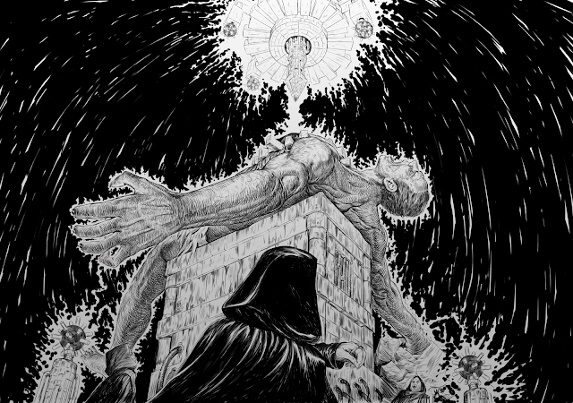
This image was a big failure in perspective but I think it's good to sometimes reflect on failed drawings as part of the learning process. Thinking about why an image didn't work out as well as you'd hoped can help you identify ways to improve. In this one, I got carried away with the details and shapes because I was trying to make it look cooler, and I paid less attention to my 3 point perspective grid. Because of this, a lot is off about the image. This reminded me to maintain a strong focus on the perspective grid throughout the process.
This last image was done with four point perspective.
I came to realise that the more vanishing points, the more time and focus it takes to
finish an illustration. My 3 & 4 point perspective isn't perfect but I'll keep at it.
Subscribe to:
Posts (Atom)

